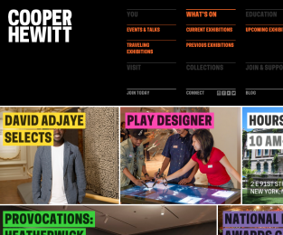
This holiday I went to the Cooper Hewitt Design Museum to see an exhibition on “How Posters Work”. Interesting, to see the principles of (in thsi case) graphic design being laid out and examined, and to learn more about the thoughts behind a work of a designer. Check out the website for more on this.

What struck me most, was the fact that through the decades of graphic design there are so many different outcomes to one and the same question: how to get attention for your message, product, event, with the same basic elements of design: layout, form, color, typography. There’s repetition (patterns), focus, balance involved too, contrast, harmony and dissonants and rhythm. So many possibilities with just a couple of ingredients. To see the outcome of this, through the years of graphic design, is amazing and wonderful. Go see for yourself!

